Observing the architecture simplified version
Virtual visit to Barcelona Pavilion 1929(43)
Ludwig Mies van der Rohe 1886-1969(83)
photo by kajimoto 2010.10
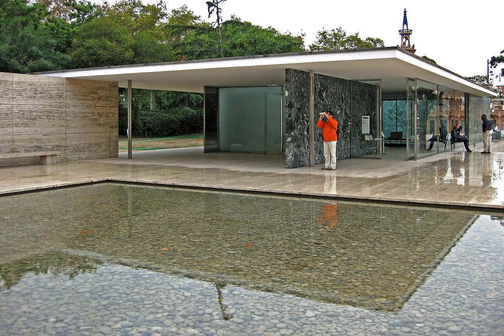
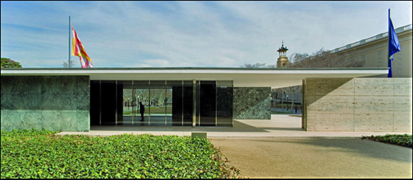
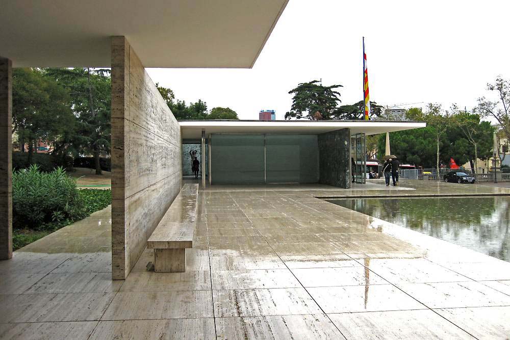
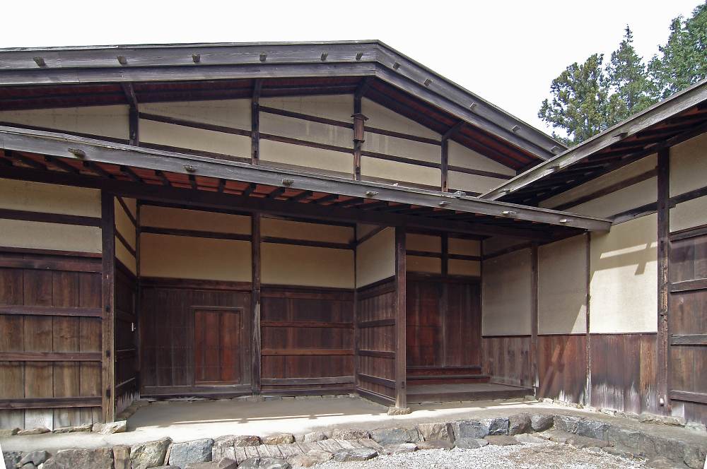
The bottom of a large pond is paved with pebbles.
The ceiling and eaves overhang far out reflecting in the pond. The white board depicts horizontal plane entering inside. The travertine floor( variegated marble).
Although not clearly visible, the thin columns are mirror finished..
And the dark green marble boards stand (are composed) in same direction (parallel).
The ceiling is a flat board overhanging as eaves as if to float in air.
The white ceiling is flat in one board uniting clearly with inner space. The installation such as lighting is not observed on the plain ceiling. A single white plane reminds of a geometric plane. This unreal and geometrical appearance, erasing material sense could be defined as abstract architecture. On modern architecture term, "non- decorativeness" refers to abstract architecture as well.
(The ceiling and the eaves of Barcelona Pavilion can be defined as abstraction of Japanese conventional architecture)
The ceiling is supported by eight cruciform steel columns.
The cruciform columns stand slender and look even like the mirror finished sash designed to almost disappear. Generally, the established buildings before this would be supported by thick and powerful columns shaping out the space clearly
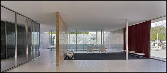
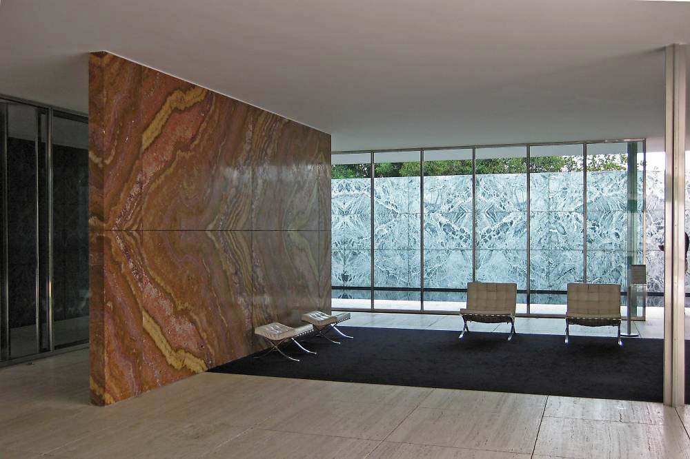
The next point to observe is the marble walls.
Since the columns support the ceiling, the walls have been released of structural support. Thus the wall design could focus on the interior making, that is to say, how to arrange (compose) the interior space. Mies called this composition as "walls standing free".
Here all the walls and the glass planes are distributed "slided" not coinciding with the structural columns..
 From the interior perspective of Barcelona Pavilion Installation by SANNA
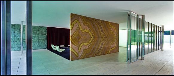
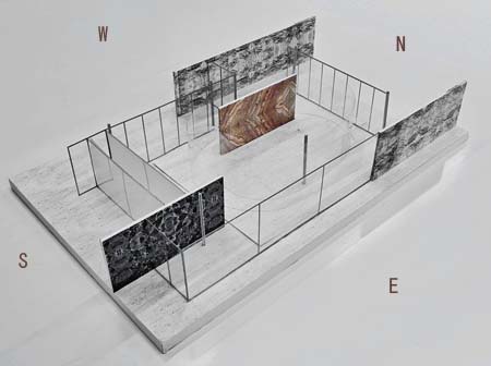
Let's look at the plan perspective, from which the whole composition is comprehensible.
In the interior, there are three dark green marble walls and then an onyx marble wall on west side all distributed on north to south direction. This reveals that the space is open wide on north to south direction. As the entrance is west side, one would get in by the onyx marble wall side. And the placement of the seat for king and queen of Spain should have been with this onyx wall in the back. This way the effect of the onyx wall is comprehensible. Probably with their back to this wall the royalties should have stood facing the gathered people on east. ( Although this rendition doesn't follow the idea of furniture placement below)
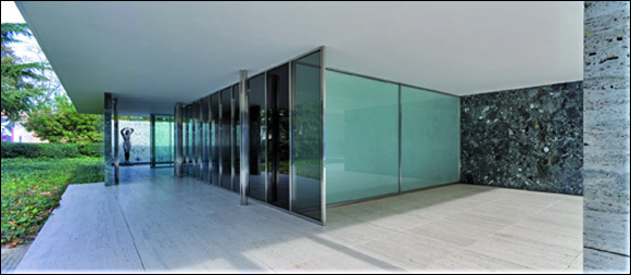
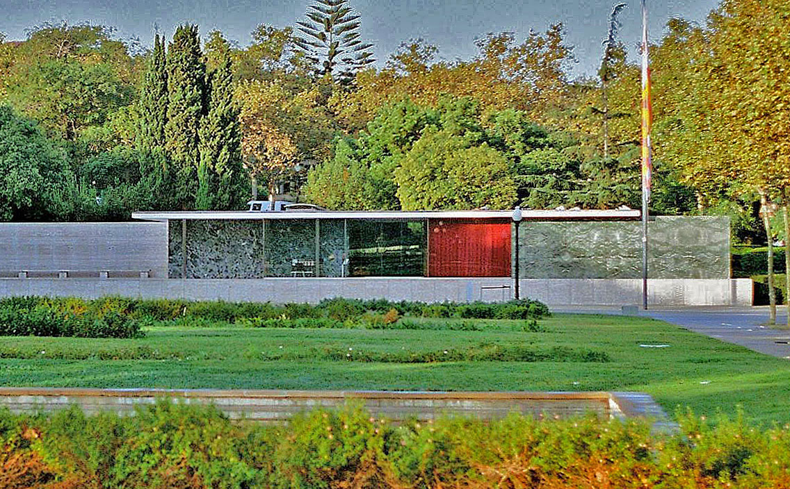
The next point to observe is the glass screen.
There is a large transparent glass framed on the east side. Over the glass screen, the king and queen of Spain must have waved their hands outward toward the citizens. The exterior floor, the podium, on this side is approximately 1400mm above the ground, which is adjacent to the front plaza. Many people must have waited to welcome the king and queen on the plaza. At the west side entrance, the "smoke"glass divided in small pitch slightly darkens the scenery. On this side the glass wall is extended one grid southward. The glass doesn't enclose the space but is arranged as a screen in plane coordination.
On the south side the large glass is double glazed and it is called the light glass box in milk-white. The toplight is installed inside this glass box and it is illuminated during the day. However, the outward sight is blocked out and we are not able to see the large reflecting pool on this side. This enclosure may bring out calm atmosphere inside.
On the north side the pale green colored glass wall is framed divided in small
pitch.The marble walls beyond enclose the small reflecting pool like a court house entirely shutting out the outward sight. (Though this is omitted on the perspective above.) Thus the fluidity of space ascends here. And as the black glass is pasted on both the side and the bottom of the reflecting pool, the fluidity of space flows downward acquiring deepness contrary to ascension.
Thus the variations of glass plane had been tried out in many ways.
The stone walls and the glass screen have been put on the ceiling directly and each is arranged (composed) as one board. Surprisingly, it is only recent that
this process of having one glass plane glazed straight up to the ceiling had become generalized.
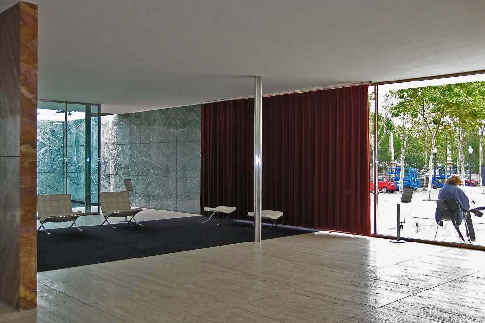
From the onyx marble wall side the black carpet is spread out to the sash on
eastside. The cardinal curtain is hanged over the glass plane extending 1200mm more than one sash. The curtain had been drawn before the citizens for the king and queen to wave to. Beyond the large glass screen they should have gathered to welcome the royalties.
This seems to be the best photo angle. It is the angle observing horizontally overhanged roof as ceiling and eaves. The classical statue is observed on far sight, and the walls standing free from north to south direction push out clearly. It was good to rain that day. The stone quality is visible vividly. Although the blue sky is not there, the sight under the eaves can be seen clear. The architecture photos on rainy days are good as well.
 (from the web)
The dark green marble, the cardinal curtain, the black color inside and the travertine base. These elements of wall planes face the front plaza and are coordinated producing simple plane composition(frontality). The design looks as though temporary and not finished. It is so simple and highly abstractive.
This building refers to the German Pavilion for the International Exposition Barcelona 1929. Since it is so well known in the architecture world, "Barcelona Pavilion" without saying refers to this architecture designed by Ludwig van del Rohe Mies.
Although this was the German Pavilion it was not intended to exhibit the works of industrial goods . It was required to hold the reception to host the king and queen of Spain as they signed the "golden book" at the Exposition. As the requirement of the building use had been so simple, Mies was able to construct purely in his architectural image. It has been highly abstractive.
Ludwig Mies van der Rohe was one of the master modern architects. He was then 43years old and was already known for the planning of glass skyscraper and such building as Weissenhof Colony.
Le Corbusier 1887-1965(78)
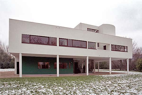
Villa Savoye 1929-31(44) " the cube wallarchitecture"
Another great master of modern architecture, Le Courbusier, designed this architecture. He created the pilotis and this way he had lifted up the white cube and acquired flowing sense (abstraction). Then the interior space was designed to open this cube. That is to say it was still the cube. Because this had been the authentic sense of interior space in Europe.
In contrast the Barcelona Pavilion is flat and one story high. Under the flat ceiling and eaves supported by slender columns, the "board walls" were arranged in one direction, acquiring high air flowing space, as if the breeze would blow through the interior and exterior.
Certainly this kind of structural architecture with only the roof to limit the space is authentic and traditional Japanese style. It is my speculation that Mies was deeply influenced by Frank Lloyd Wright's architecture as down below and the Japanese architectural space making. It can be said that all this had been crystallized in Barcelona Pavilion at last.
Frank Lloyd Wright 1867-1959(92)
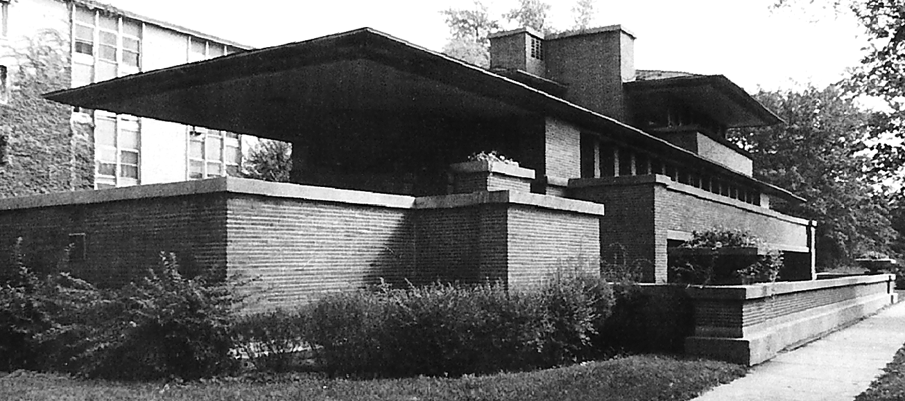 Robie Residence 1906 (from the web)
He is another early master architect of modern architecture. And this is the house which Mies had admired. It had great influence on Mies.
Around 1910, the scandal led Wright escape from U.S. and travel and lecture in Europe with his new partner. He published his works and advocated the modern housing known as Prairie Style architecture( above)
What is modern about this brick made residence?
The cantilever hangs over far out. Its influence on Mies can be observed at his plan for the " Country Brick House".
Innovating the previous style of distributing individual rooms, Wright brought out the open plan where he succeeded to provide more continuous and flowing space. This innovation was highly evaluated by European architecture world.
 (from the web)Shimazaki House 1690 Joan 1618 Urakusai Oda
Japanese walls were "free" from the architectural structure.-1 Shinji Shimoyama
These are the examples of walls pushing out in Japanese architecture. This is to introduce the rendition that the walls had not been used in structure in traditional Japanese architecture
And all this still influences contemporary Japanese architects nowadays.
Yoshiro Taniguchi 1904-1979 (75)
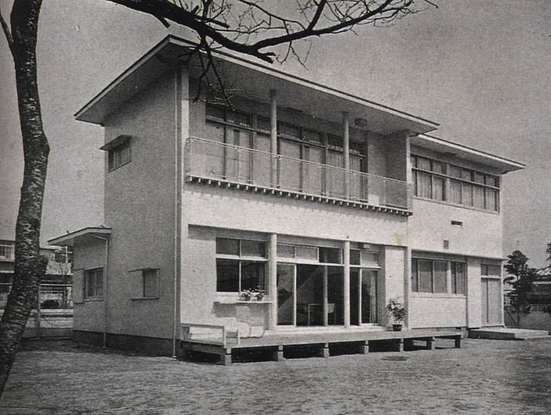 1937 K's Residence 1937 *5 Shinkenchiku
This had been built 8 years after the Barcelona Pavilion. By this period the trend of Japanese modern architects had been to design and replace the palace style characteristic of Fujiwara period architecture in reinforced concrete. Taniguchi's design was to use the board wall in this style.
Yoshio Taniguchi 1937-
 1991 Marugame Genichiro-Inokuma Museum of Contemporary Art(photo by goto)
Instead of making the whole building cuboid, the facade was designed gate shaped.
The walls stand(triple plane) producing the depth. The left side stairs designs ascendingdepth, while the right side wall is slitted and airy. The top is yet thick. What impressed me at first was the big canvas of the artist on the facade. I first thought the facade had been designed as the gate eaves. It was only after I encountered the Kikusuitei by Yoshiro Ikehara that I recognized the design of making "the walls stand".
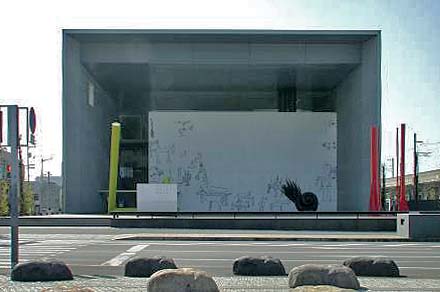
 1996 Tsukuba Capio
The top is board constructed. The gate stands as the exterior. As it unfolds such a depth
how could it be structured ?
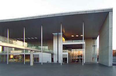
 1999 The Gallery of Horyuji Treasures, Tokyo National Museum
In contrast to the volume of the building,the gigantic and thin gate had been designed, unfolding the innovated expression of board wall design. The thin gate covers the glassentrance hall spacing large airy space in between. The double effect of glass and thin board can be observed. Furthermore, the thin board top is slitted largely. The various slitted portions express lightness. Since the building main is set backward, the cafeteria terrace on the left side can be seen through. The effective phase of "the board wall design" can be observed here.
When we compare the three opuses shown above, we can well see the light, thin and airy phases of "the board wall design".
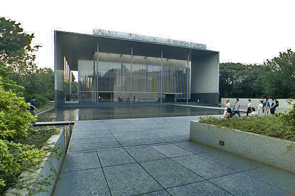
 Kyoto National Museum South Gate 2007 (from the web10+1) (photo by Igarashi Taro)
I encountered this architecture ten years ago on visiting the Sanjusangendo in Kyoto. I remenber that it reminded me of the Barcelona Pavilion. Had it been under construction? Although it was different the composition of elements such as the roof and walls had been quite similar to that of the Barcelona Pavilion.
Kazuyo Sejima 1956 -
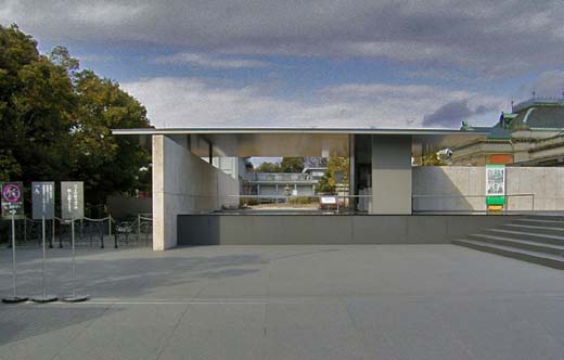
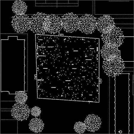
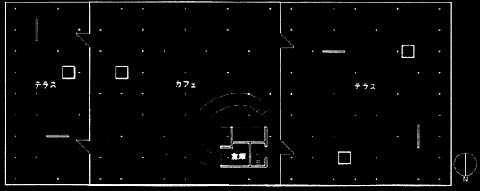 Koga General Park Cafeteria, Koga city Ibaragi prefecture 1998
Sejima's plan and trial had been to reduce the amount of board walls of Mies' Barcelona Pavilion to the minimum and to minimize the diameter of a steel column.
Junya Ishigami (1974-)
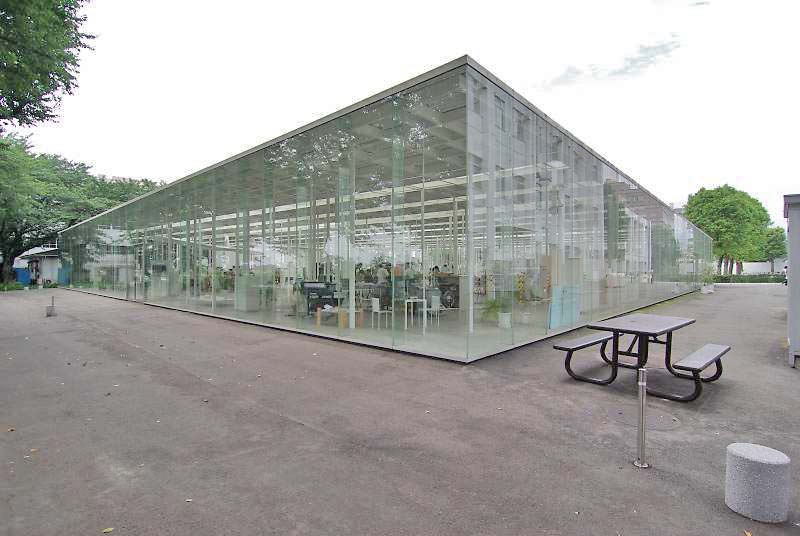
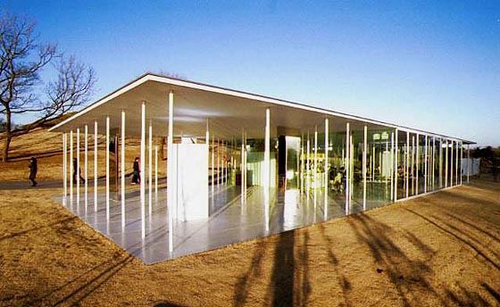
 Kanagawa Institute of Technology (KAIT) (photo by aibo2)
The structural supporting walls disappear entirely and only columns support the structure. The flat bar columns are set on length and width direction supporting the structure.
It is the ultimate figure of what Mies had tried out at the Barcelona Pavilion where the roof boards had been supported only by the columns.